



Google evaluates your site with mobile-first indexing: the version used for ranking and the index is the one a phone visitor sees. A site that looks perfect on desktop but loses content on mobile loses both users and rankings.
Why mobile-friendliness is critical
Most users search from a phone for most topics. If text is unreadable, buttons are too close together or the page scrolls sideways, visitors do not return. Google may also not index content that is missing on mobile.
How to check
- Chrome DevTools: press F12 and try a phone size with the device toolbar.
- Lighthouse: run a mobile audit from the Lighthouse tab in Chrome.
- SEO Analysis report: the SEO Analysis runs mobile viewport, responsive image and image lazy-loading checks.
- A real device: browse on at least one iPhone and one Android.
Google retired the standalone Mobile-Friendly Test and the Mobile Usability report in Search Console at the end of 2023. The tools above are now the main way to check.
The most common errors
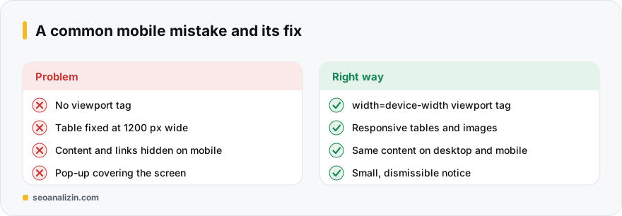
- No viewport tag. The phone renders at desktop width and the page shrinks.
- Fixed-width elements. A table or image 1200 pixels wide creates horizontal scrolling.
- Small text and close tap targets. Body text should be around 16 pixels or more on mobile, and links should be easy to hit with a finger.
- Missing content on mobile. If text, links or structured data visible on desktop are hidden on mobile, Google may not see them.
- Intrusive overlays. Ads or pop-ups covering most of the page drive users away.
The correct viewport tag is a single line and belongs inside <head>:
<meta name="viewport" content="width=device-width, initial-scale=1">Images and speed
Responsive images (srcset) prevent downloading needlessly large files on mobile. Add loading="lazy" to offscreen images, but not to the main image at the very top of the page. For speed, see the Core Web Vitals guide.
A five-minute phone test
Before moving to tools, try these five things on your phone:
- Does the home page scroll sideways?
- Is the text readable without zooming?
- Can you tap the menu and buttons without hitting the wrong one?
- Does a pop-up or cookie notice cover half the screen?
- Do tables and images fit the screen?
If any of the five fails, match the problem with the mobile checks in the SEO Analysis report; for the speed side, see the Core Web Vitals guide.
Mobile-friendliness questions
Does being mobile-friendly directly affect rankings?
Because of mobile-first indexing, your mobile version is the basis of evaluation. A site broken on mobile looks weak to both users and Google.
Should I use a separate mobile site (m.)?
Usually not. Responsive design with one address and one content set causes the fewest problems.
Can mobile and desktop content differ?
They can, but Google uses the mobile version. Content missing on mobile may not count toward rankings.



Join the discussion
Share your experience or ask a question about this guide.